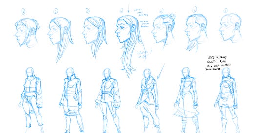
Hey friends! I’m turning things back over to the amazing Phillip Sevy today for another guest post. This is one I’ve been really excited about for a while: how he designed and developed Amelia.
As the writer, I tend to work a lot on her internal workings, but when it comes to the externals, I knew that she needed a visual hook - for which I was happy to turn her over to my incredible co-creator Phil. Here he is!
Hello everyone! I hope you enjoyed Chapter 2. If you haven’t read it yet - you can for a mere monthly subscription and skip the two week delay for free subscribers. We put a LOT of work into that one and we think it shows - and we’re only getting started.
This week, I wanted to take some time to talk about the design process and evolution of the designs for our main character, Amelia. I’d probably have to dig way back through the archive to find the first discussions we had about our main character (that would eventually become Amelia), but let me just walk you through the visual design process.


